Enhancing the User Experience for Workflow Management in a Web Application
The goal of this project was to redesign a workflow management web application used by operators to monitor and manage operational tasks efficiently. The redesign focused on improving usability, addressing customer requirements, and creating a more streamlined interface for everyday operations.
Discovery Phase:
To better understand user needs and pain points, I conducted interviews with operators, supervisors, and stakeholders who use the platform. I performed contextual inquiries by observing users interacting with the app in their daily workflows.
Feedback revealed several challenges:
Difficulty distinguishing between live and historical data.
Inefficient search and filtering functionalities.
Overly cluttered and redundant data presentation in the main table.
Research and Data Collection:
I synthesized findings from user interviews and analyzed support tickets to identify common frustrations. Additionally, I reviewed competing systems for benchmarking. This phase informed my key design goals:
Simplify navigation to quickly access critical information.
Optimize data presentation in the table to reduce cognitive load.
Design popups and interaction flows for efficient editing of operational data.
Design Solutions:
Header & Navigation:
Introduced a clear toggle to differentiate live and historical data views.
Enhanced the refresh functionality for real-time updates.
Updated the navigation structure for better usability.
Sub-Header Functionality:
Improved search with all-column capabilities.
Redesigned the priority filter for ease of use.
Included timestamped data for better transparency.
Table Layout:
Prioritized essential columns such as “Priority,” “Comment,” and “Signatur” while retaining access to all data.
Applied text wrapping for long entries to improve readability.
Streamlined column interactions with dropdowns for fields like “Signatur” and “Bord.”

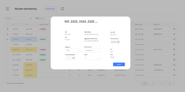
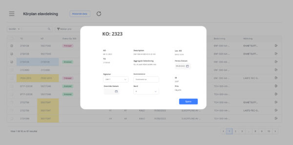
Popup Enhancements:
Simplified editing workflows for individual and batch operations.
Limited editable fields to reduce errors, focusing on user-specified columns.
Ensured consistent interaction patterns across popups.
Prototyping & Testing:
Using Figma, I created wireframes and interactive prototypes of the updated interface. I conducted usability tests with a mix of new and experienced users, iterating on feedback to refine the design. Tests showed improved task completion times and fewer errors, especially with the revamped table and popup workflows.
Outcome:
The redesigned interface significantly enhanced the user experience, enabling operators to complete tasks faster with fewer mistakes. Users reported a more intuitive and visually appealing interface